Mark Tegtmeier
I was hired as the lead designer (later promoted to director) at UserIQ, an Atlanta-area SaaS company focused on serving SaaS customer success teams with a comprehensive platform. I was tasked with establishing product design efforts and processes following the departure of the previous team of two designers.
UserIQ leadership made the decision about 6 months prior to my arrival to pivot from being primarily a product analytics tool for product teams (including in-app surveys, product tours, and pageview/click event tracking) to focusing on the rising customer success market.

Coming into a new environment with an established base of research, understanding of the problem space, a wealth of interaction with customers across sales and CS teams, and a complex product, I started my work by working to thoroughly understand the current situation. I dug through existing research, spoke with several team members across different departments, reviewed existing customer survey results and feedback, and performed a deep audit on the existing platform.
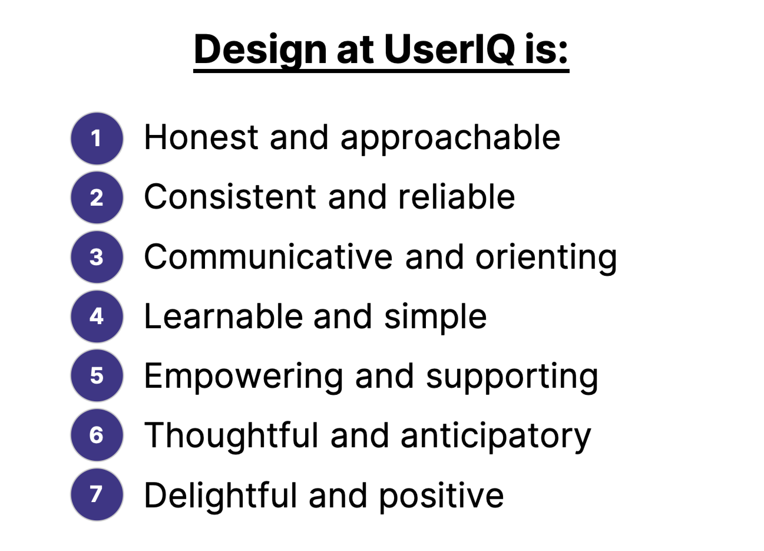
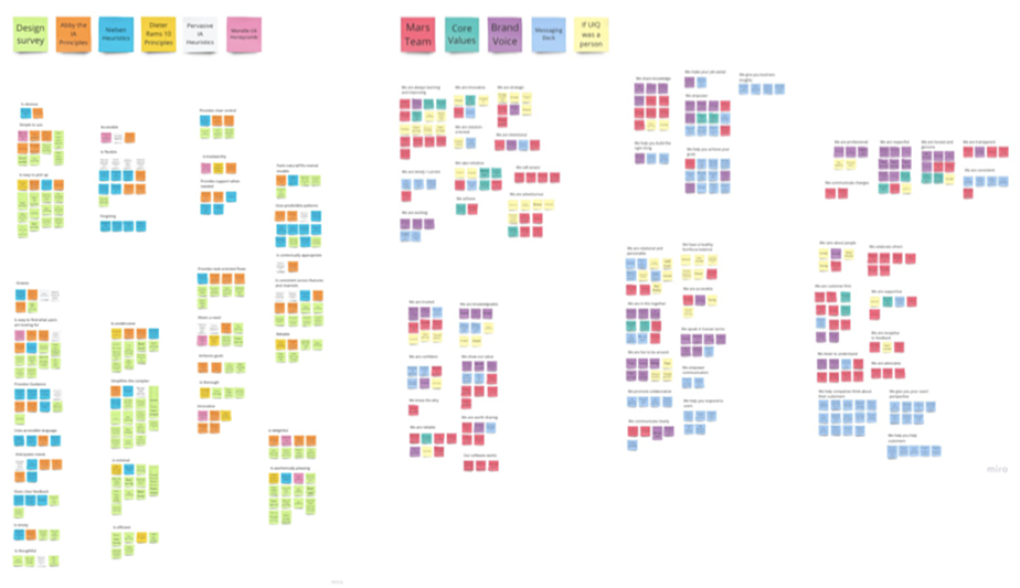
One of my first steps was to build buy-in into the foundations of the new design team. I crowdsourced input from across the company related to how each department views the importance of design, how they want customers to perceive the product and the company, and the core values of the company. Combined with industry standard logistics, I used these insights to develop our UserIQ Design Principles, which both informed our design strategy and served as a measuring stick for evaluation.
I then completed thorough design audit of the application – an 80-or-so-page PDF full of screenshots, prioritized issues based on our new design principles, comments, and proposed solutions and next steps. This garnered significant attention to the need for renewed design efforts and informed confidence around where we needed to go with our product next.
One of the major needs was a design system that could be leveraged in improving existing features and building new ones as we moved into the CS space. While the previous design team had made good progress with early rapid feature development, there were issues with consistency, accessibility, and usability of workflows that amounted to significant enough design debt that needed to be tackled sooner than later.
When I arrived at UserIQ, our founding CPO was beginning to transition away from the company, so I filled some of the void until our new CPO came in. (Once our new CPO, Lawton Ursrey, stepped into his role, I continued to be heavily involved in the overall product strategy and roadmap.) Based on the research, customer feedback, audit, and conversations and workshops with the executive leadership team, I developed an initial feature roadmap with a focus on design timelines.
Based on our dual need for a more solidified design system and new CS-oriented features to move into the market quickly, we determined the need for a design team.
Having just taught a UX immersive course at General Assembly prior to moving into my role at UserIQ, I was equipped with the beginnings of a designer network and an experiential knowledge of how to identify strong junior designers who could readily jump into a startup environment and begin making a difference. In a fairly short amount of time, I conducted an interview process with support from my supervisor and other departments that produced two strong generalist hires – Chanel French and Denise Jimenez, and later two short-term contract researchers – Jason Cook and Monet Burse.
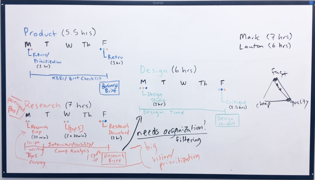
I initially divvied up feature responsibilities among the design team structured around rapid sprints to catch up with the developers, which we eventually evolved into a more holistic product process that allowed for greater developer involvement, testing, and iteration.
A design system done right is much more than a beautiful component library, though aesthetics are a high value to the end experience. We relied heavily on our home-brewed design principles to incorporate accessibility, usability, learnability, and localization considerations into the core of the product.
We then cataloged existing UI patterns, colors, interactions, labels, buttons, icons, and more to understand how they were currently being used, what they signified in the app as it stood, and where there were inconsistencies.
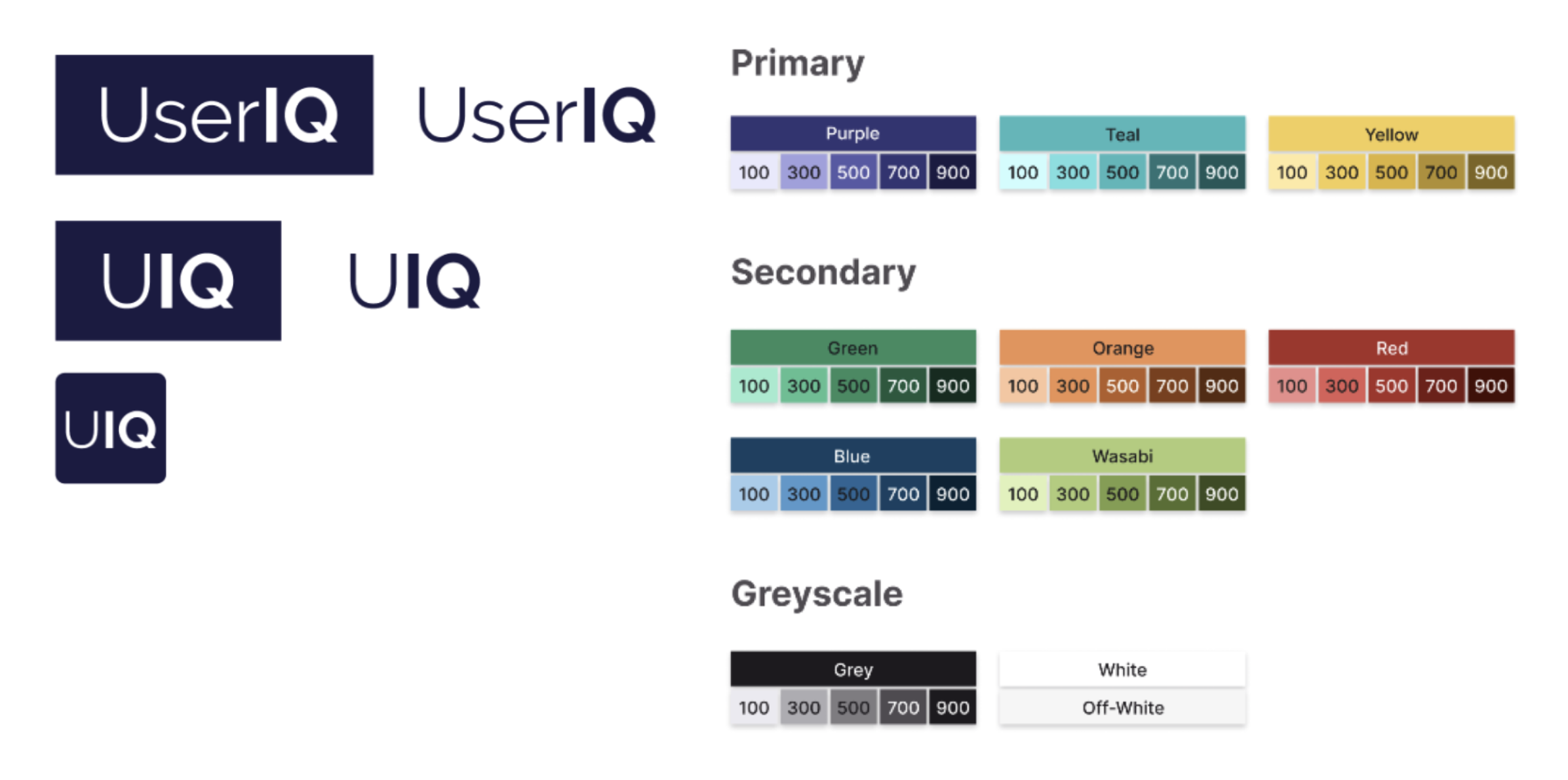
We defined new brand colors and a new logo to give the app a more up-to-date look, but we also prioritized in our color selection high color contrast and ascribed meaning to colors that would flow consistently throughout the app, especially with the importance of customer health metrics to CS-specific workflows, moving away from the monochromatic look of the app’s previous home dashboard.
We used the nascent new customer health dashboards as a test case for defining layouts and flows of dashboards as well as new color and graph patterns. We defined standards for inputs, buttons, dashboard cards, basic interactions, and more complex recurring molecules such as filters.
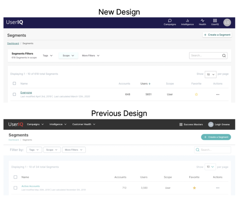
Our design system work both helped to refresh and introduce immediate improvements to the usability of the app, as well as invigorating both the customer base and sales and marketing teams. You can read more about the initial stages of the design system here: https://www.useriq.com/blog/the-useriq-design-system
“...the fact that its interface is so simple but at the same time so powerful is a great plus...”
– Helena G (via G2)
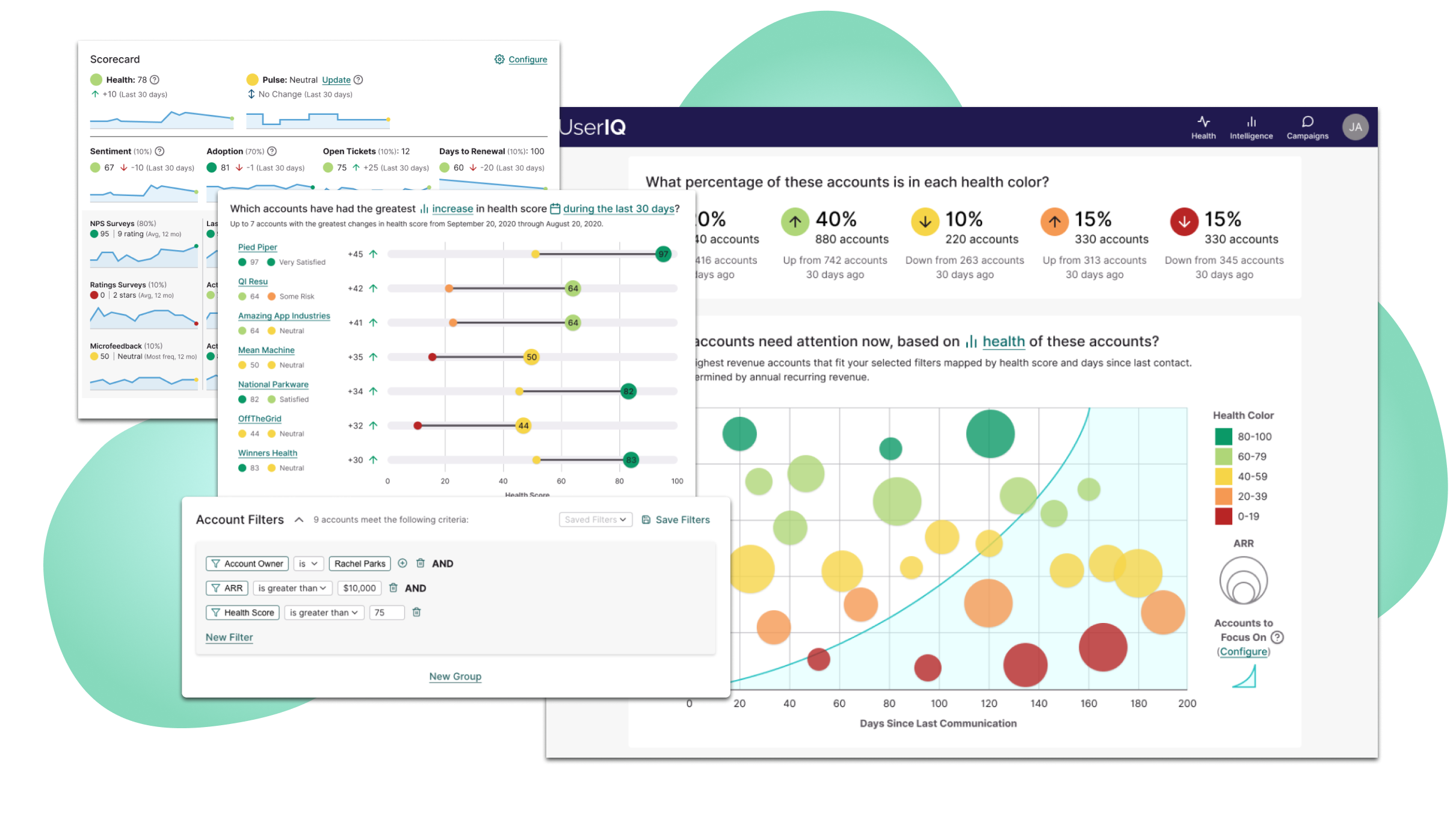
With the move into customer success as a data-heavy platform, one of our first foundational moves to help customer success managers was to provide useful data visualizations that would help CSMs to understand which accounts to focus on, as we found from our research (interviews, customer panels, and feedback).

We initially began design of the dashboards through subfeature-focused sprints consisting of user research, internal workshops, prototyping, and testing. We started by discovering the key questions that CSMs wanted answered, then arranged dashboards based on those questions.
Our initial wireframes were driven by these questions, following a philosophy we adopted for all dashboard design: Start with the highest level information toward the top (i.e. “What is my book of business doing overall?”, “Which accounts need my attention today?”) then move into more detailed information (“Which accounts’ health has changed the most?”, “What factors contribute to how these accounts are doing?”).
What resulted was three dashboards (overall book of business, individual account, and individual user), each including multiple tabs. The main tab of each presented visualizations related to overall customer health and each subsequent tab focused on a component of the health score.

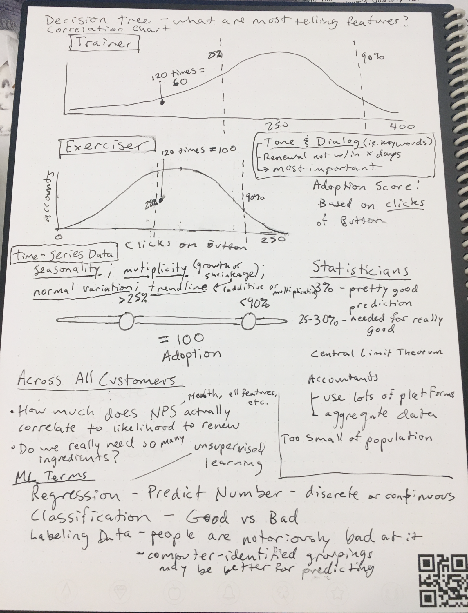
It was important that for each card, we had a clear purpose informed by our research and stakeholder understanding, and that questions were answered in a way that maximized at-a-glance understanding. To that end, pioneered new visualizations to convey data in a more dynamic way than graph libraries were able to offer by default, such as our barbell charts conveying biggest swings in health score and our featured custom bubble chart (leveraging color, placement, and size to rapidly answer multiple questions related to customer health score, ARR, and the time since accounts had been engaged.
“...the health score dashboard allows us to quickly assess our customers health, pulse, adoption and usage.”
– Amy E (via G2)
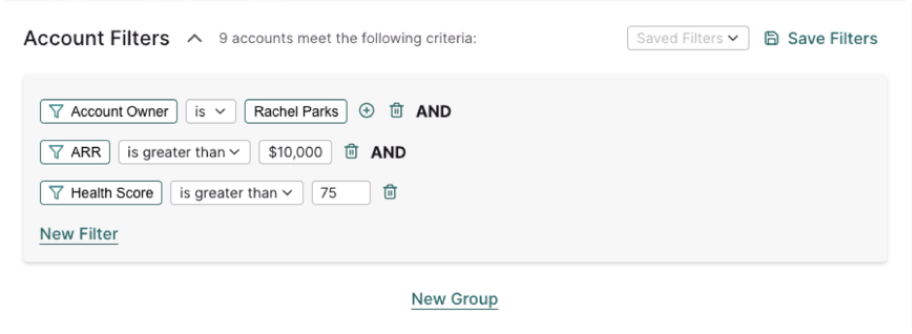
In addition to providing different angles into the data through toggles on several of the cards, we introduced a robust sentence-based filter system, allowing for real-time slicing of current data and replacing our previous system which required a cumbersome workflow and days or weeks to render the same kinds of data.
“The UserIQ platform is an easy-to-use tool… Specifically, the health score dashboard gives us an easy-to-understand overview of the health of our customers but also allows us to drill down using a variety of filters to see specific issues that need to be addressed.”
– Molly H (via G2)
Data-heavy visualizations on their own are not as useful without the ability to inform concrete action on the part of the CSM, however. Armed with data, we provided the ability for CSMs to take specific notes tied to accounts and/or users and to reach out to them. We also re-imagined the design of the system in such a way to later introduce options to target specific groups of users and accounts, receive specific notifications, and initiate automated action plans, or “plays”.

I love big-picture thinking. As we began to strategize about the design system and our first features, I created a sitemap of the app as a whole and how we envisioned it to be in the future. This ensured that we designed in such a way that we could easily add on to existing features to better integrate all the peices of a CS team's workflow seamlessly together. We were prepared to leverage common patterns, visuals, and in-context interactions once we introduced new CS-oriented features like tasks, plays, notifications, etc. and new improvements to the health dashboard.
Data has always been key to understanding customer health, flowing from a number of different sources, including our customers' CRM's, platform analytics (via our tracking snippet), manual input, and in-app surveys.
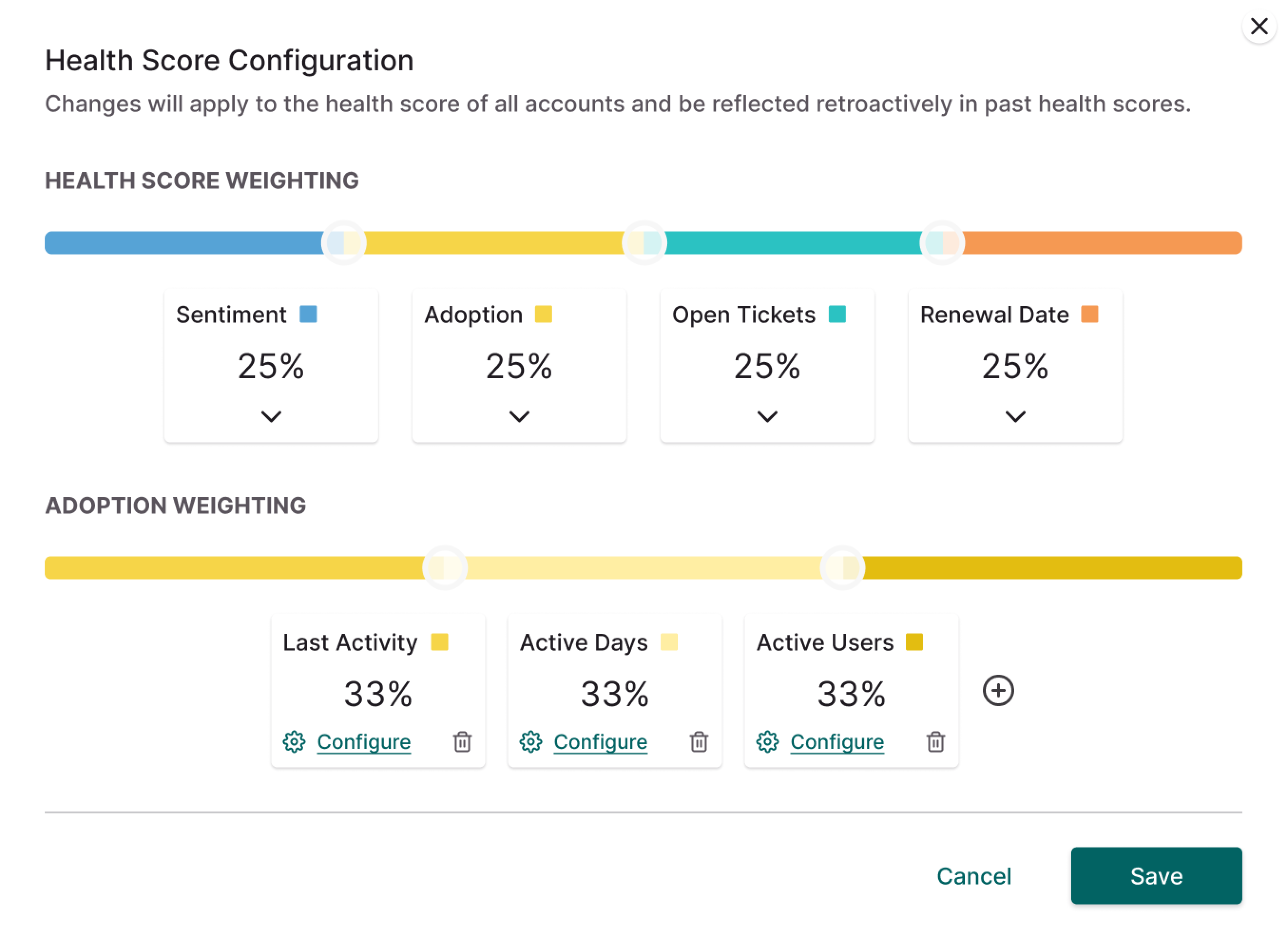
Our team worked diligently in the data of defining health scores, providing the opportunity for users to customize their own mix through health score configuration and feature tracking setup (which we later revamped significantly). To allow for an increasing amount of customization while maximizing ease-of-use, our design team adopted a philosophy of starting with ingredients and formulas of the data, simplifying these into human language, and allowing for simple customization from there, similarly to what we did with our filter logic.
As we added new features, we designed new dashboards and visualizations to help CSMs stay informed about their accounts' activity and health in a deeper way, such as when we refined feature adoption measurements and added over-time drilldowns to account "scorecards" - based on user feedback.
