Mark Tegtmeier
Due to difficulty maintaining numerous payment UIs, the multichannel retailer made a business decision a couple years before I arrived to consolidate payments across selling systems to a single UI to reduce security and fraud risks.
When I came on the scene, this payments UI had been worked on by several designers, most of them serving a short time on the product. It was only implemented in one smaller department of the retail stores with two payment options enabled. The goal was for this single, configurable UI was to integrate with all associate-facing selling systems.

During my year on this Agile product team, I was the sole UX designer and worked heavily with the product manager and engineers. I met with business stakeholders frequently, collaborated heavily with integration-partner UX designers and product teams, and conducted significant amounts of face-to-face user research.

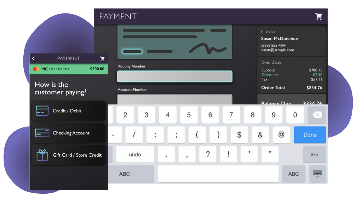
The main new feature that I worked on after joining the team was to enable customers to pay using multiple forms of payment on a single order. For example, if the order total came out to $800, users needed to be able to pay $500 on one credit card, and the remaining $300 on another, which this payment UI did not previously support. Split payments, in turn was a dependency for gift card and store credit acceptance.
Initially, I collaborated with other designers to ideate solutions and throughout the process, I involved my product team in design critiques to make the process transparent and to obtain business and engineering feedback early on. Through these critiques, some engineering considerations emerged that required that we rethink the initial UI to support an increase in payment method options.

In addition to implemented these UI changes and layout changes to solve split tender, I designed a more responsive, component-based layout from the global styles up, enabling our developers to build out new features more rapidly and providing users with consistent design patterns throughout the application.
I collaborated with my immediate product team and many other product teams to come to a solution that would make sense for all users. We collaborated on user interviews, design ideation, and usability tests. I used Sketch, InVision, Axure, and InVision Studio to layout and prototype everything from layout to animated micro-interactions. The new layout includes a dynamic balance due, a current payment method being applied, and animations to make associates aware of how each payment is affecting the total due.

In conjunction with integration partner teams, we conducted thorough usability testing, which allowed us to iterate on my designs quickly while gaining a better understanding of the specific needs and contexts of different selling systems' users.
Following a few rounds of usability testing for each new payment method within the split payment scenario, I contributed to product team meetings to determine what was needed from our developers and paired with them on the UI development.
Moving to integrate with additional sales systems meant required us to move into both tablet and smartphone versions of our payment application. As a web app, I designed the enhanced UI to easily support a move to mobile, but even so, there were some special considerations to work through for our traveling sales mobile users.
I collaborated heavily with UXers with a high familiarity with mobile users, conducted design studios to solve specific mobile problems, and as usual, involved my product team in the process. We conducted usability testing once mobile screens were defined to pinpoint areas that needed improvement and clarification.

One new feature particular to our mobile sales users was mobile check acceptance. Our business and product teams were originally planning on using a third-party system. After going through an initial design and submitting designs to a design critique, we realized quickly that the third party's process made the user experience cumbersome and included unnecessary steps. I did research into other methods of check acceptance and we landed on a process that was approved by our business partners that reduces risk to the business while greatly simplifying the sales teams' processes.

Implementing a common UI across the retailer's selling systems required not only face-to-face selling systems in stores and in mobile sales environments, but also integration into call center lead and order management systems.
Partnering with UX designers who worked on these call center systems, I visited with call center employees, interviewing them and observing them in their typical work context using the current systems. These learnings informed the flows in and out of the payment UI from the call center systems.
One new need that arose specifically for call centers was a payment card token system that enabled customers to key in their card numbers instead of speaking all card information over the phone. Instead of the call center employee hearing the card number, the system now only gives them a 6-digit token in place of the card.
In partnership with call center product teams, I designed and usability tested a call center-specific flow for entering the token within the payment flow that was implemented shortly after.
